Lively
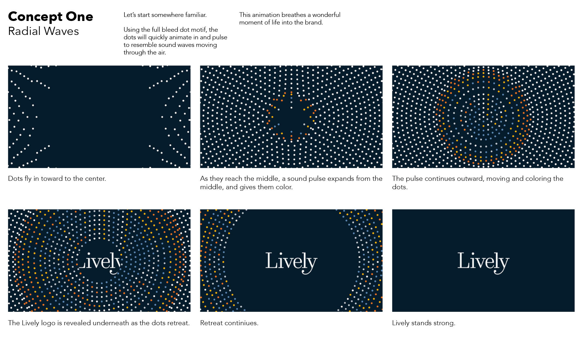
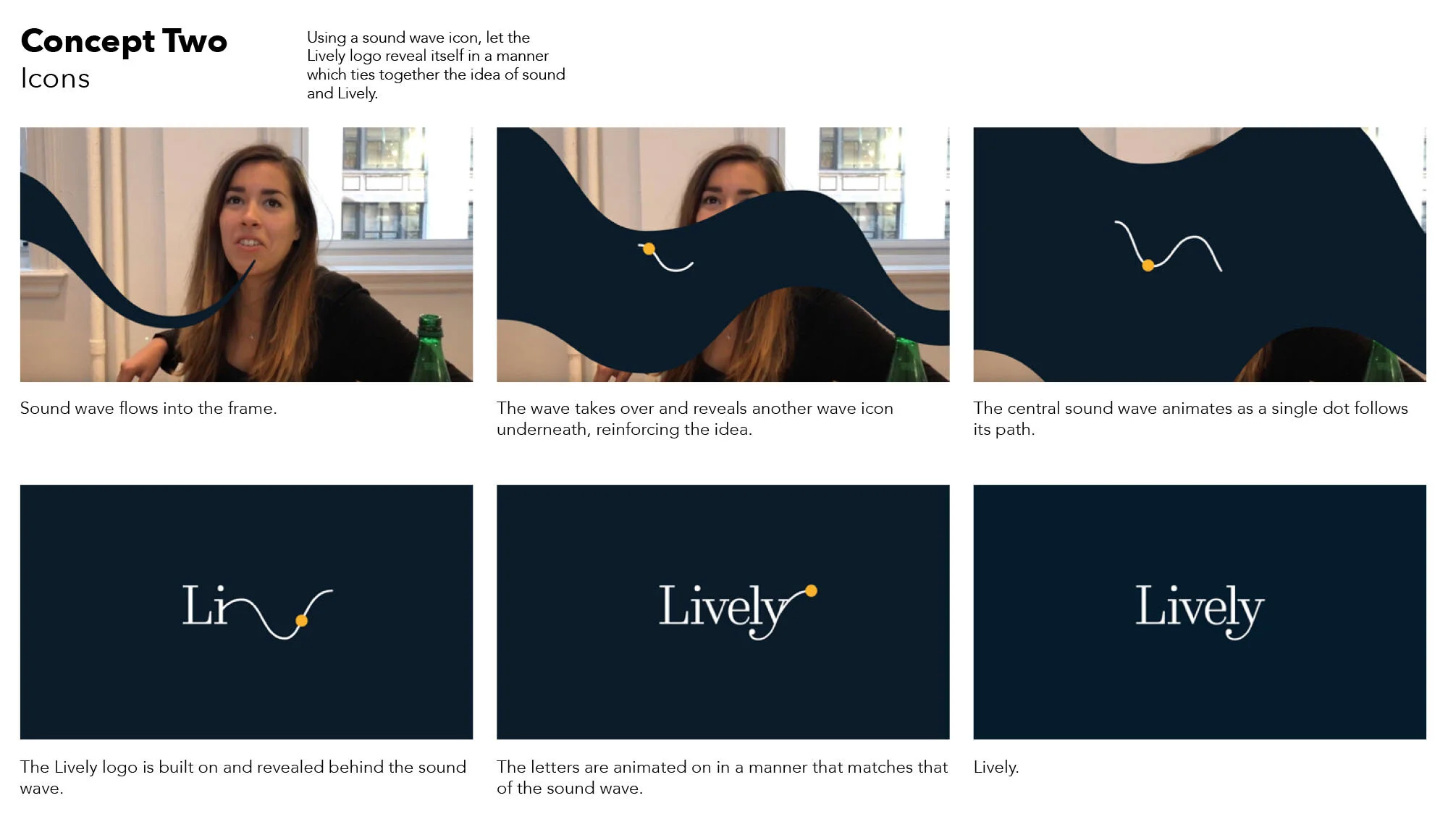
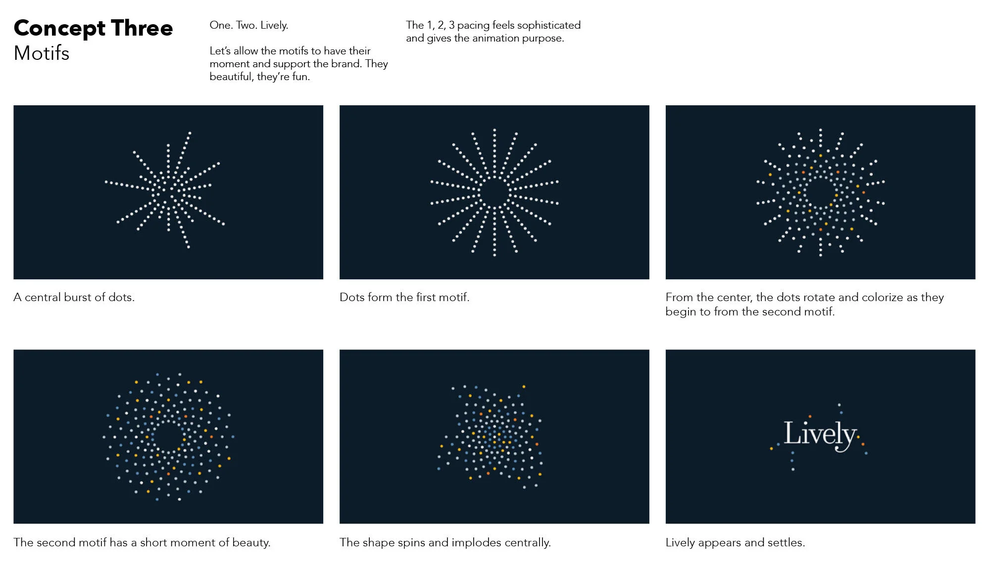
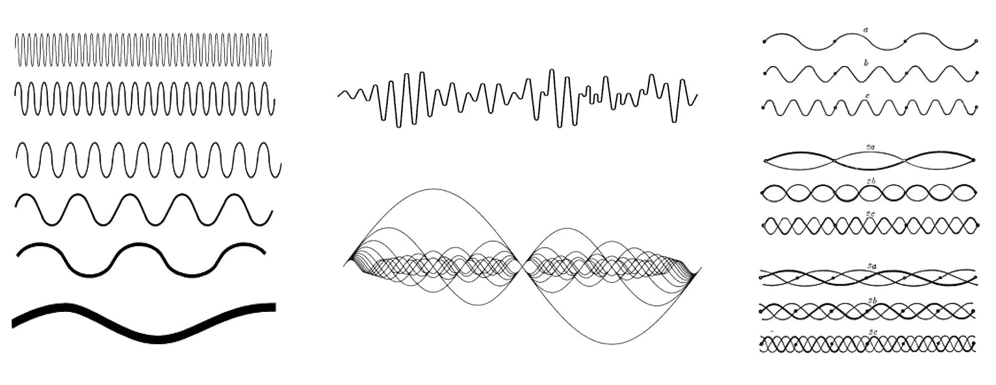
A high-tech hearing aid company was looking for a logo animation that would reflect their energetic brand in onboarding videos. I presented them with three options (see below) for the logo animation and ultimately they settled on using the colorful dot motif. The animations brought their logo to life and gave a cheerful first impression to new customers.

Codecademy
An online coding school wanted to enhance their interactive platform with an animated logo and icons. I wanted the animation to express the complexity of coding and also feel sophisticated and polished. The animations were used across their courses to strengthen their brand identity.



Pillar (acquired by Acorns)
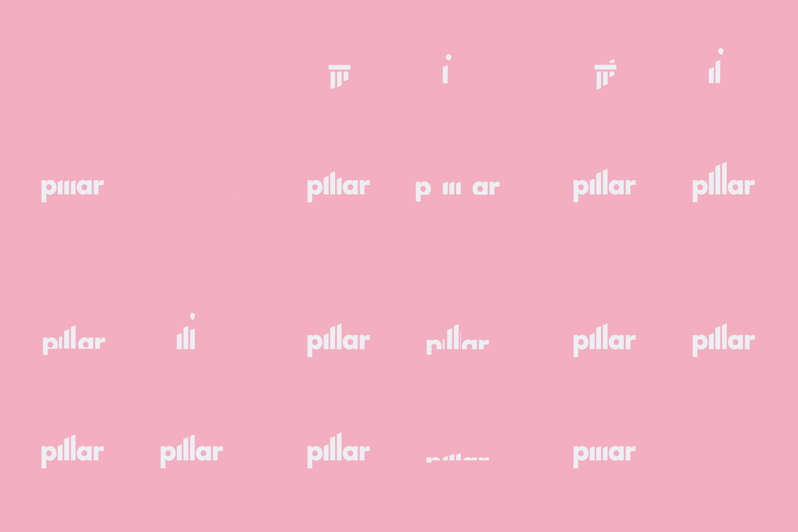
An AI-powered fintech app acquired by Acorns was looking for an animation that would amplify their existing logo. The concepts included explorations of the three pillars in their mark. I choose to connect the glyph with the logo to strengthen the bond between the two elements. The animation needed to feel strong and solid to ensure trust with their customers money and financial decisions.


Vault Health
A healthcare diagnostics company was looking for a logo that would “vault them into tomorrow.” They wanted something light and positive while retaining the masculine energy of the existing logo. The “wing” of the mark swings left while an arrow flies right, bringing a vivacity to their brand.

Kiwii-N-Bacon
The popular video game streamer Kiwii-N-Bacon needed a playful animation to introduce his YouTube videos. Drawing inspiration from the official seals of his favorite video games, I created a logo and animation that blends traditional styles with the fun and whimsy of his personal brand.

Lipstick Lille Vintage
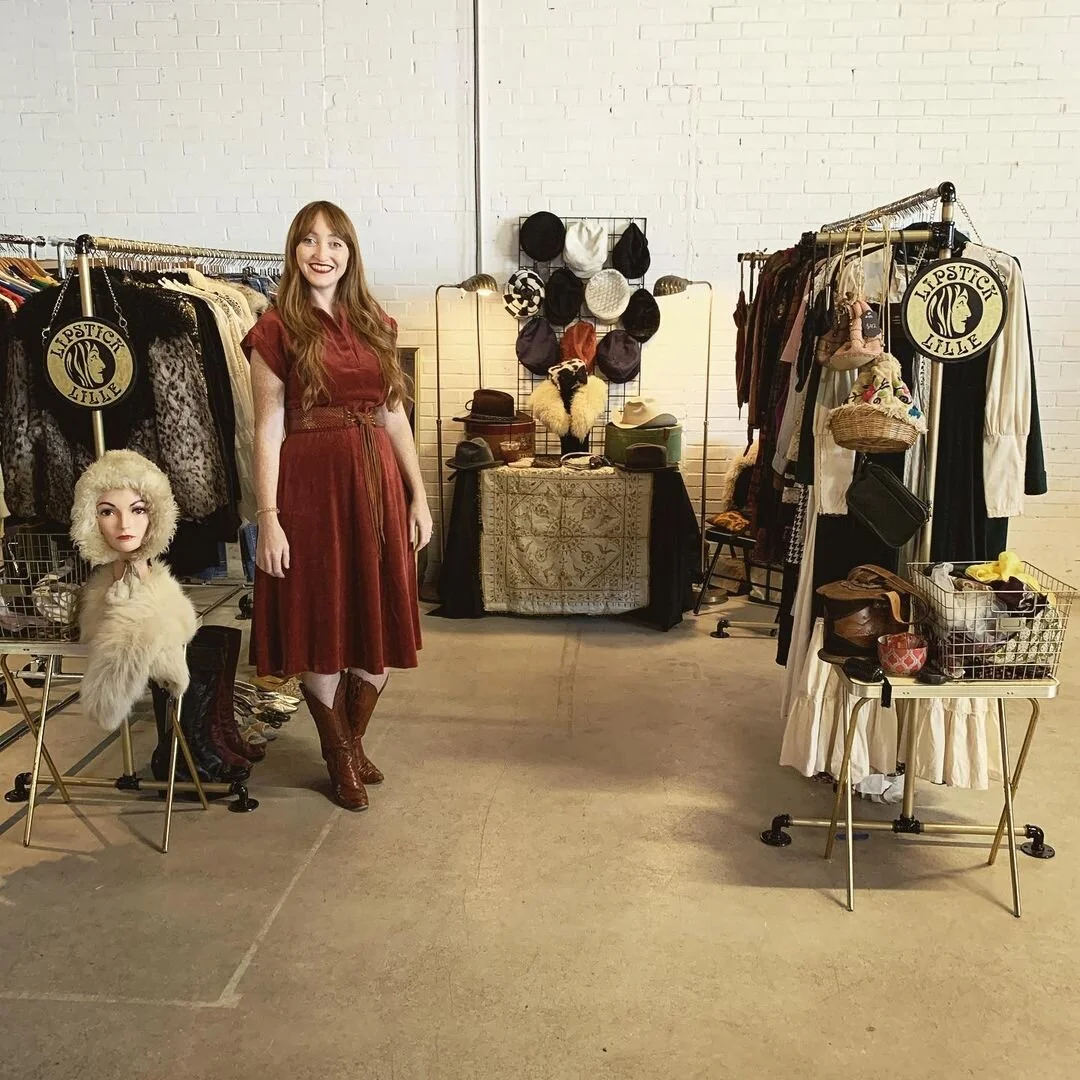
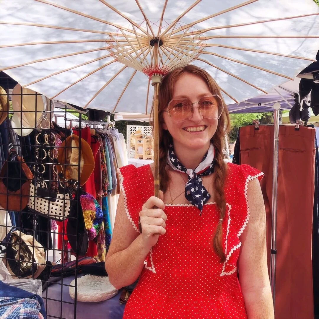
The stylish, vintage clothing company was ready to build their brand with an official logo that would live on their business cards, signage, tags and more. The logo spotlights the owner, Lipstick Lille herself, with inspiration from the 60s- and 70s-style of their collection.
Roar CBD Co
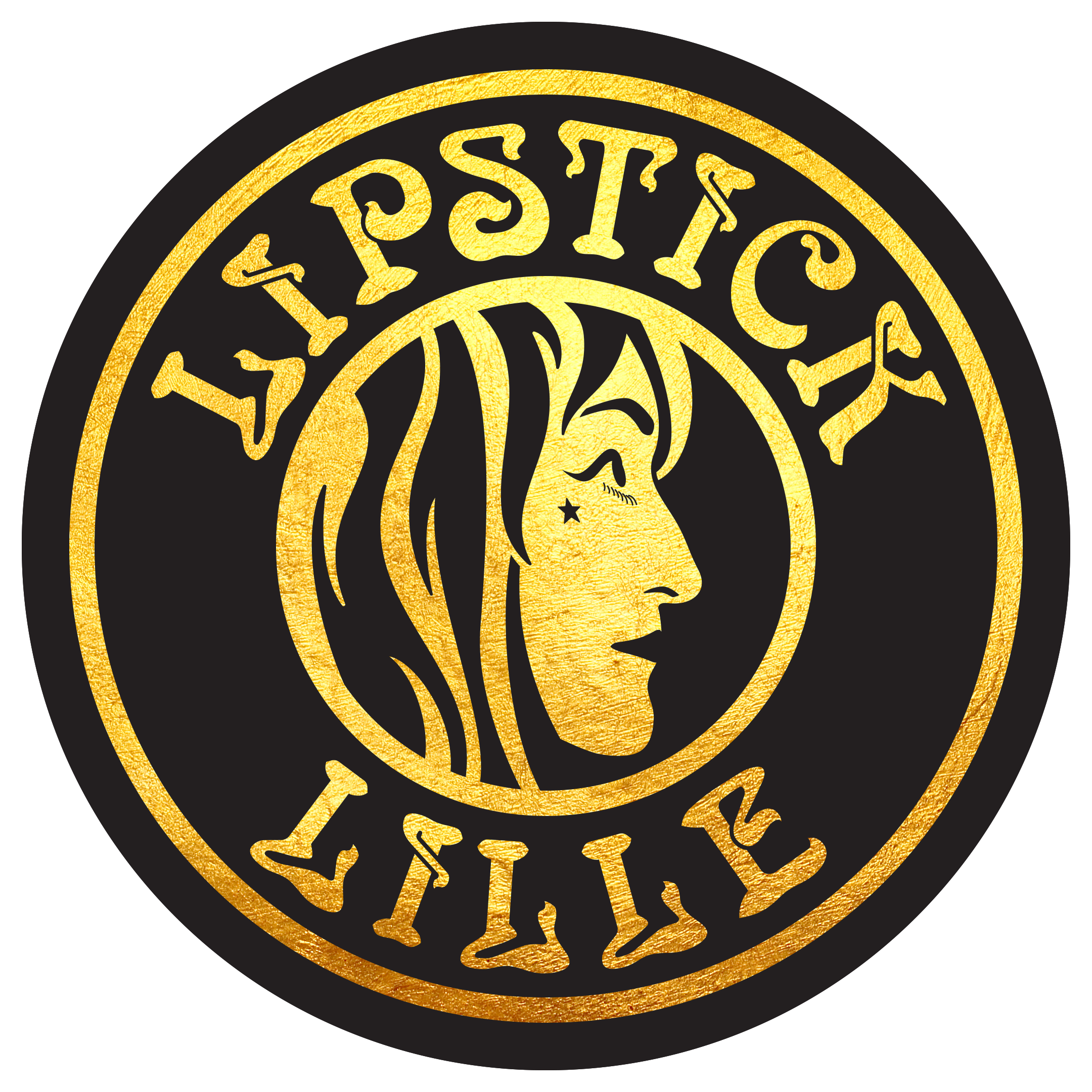
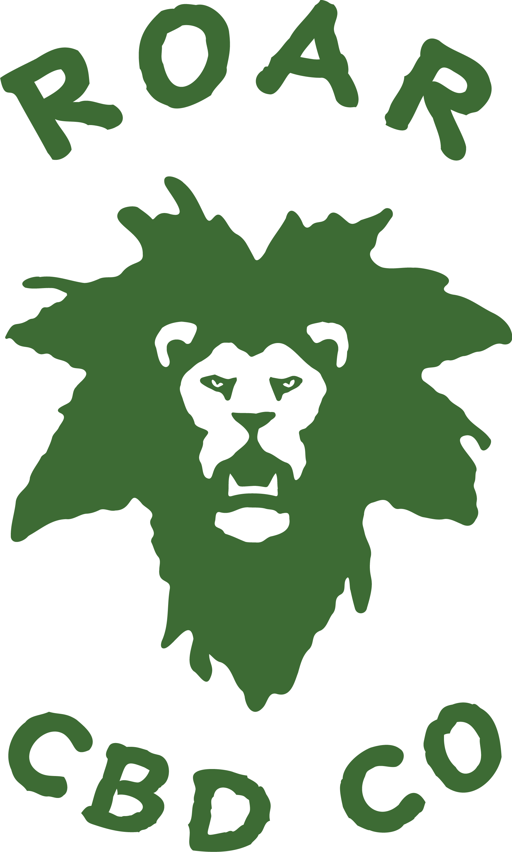
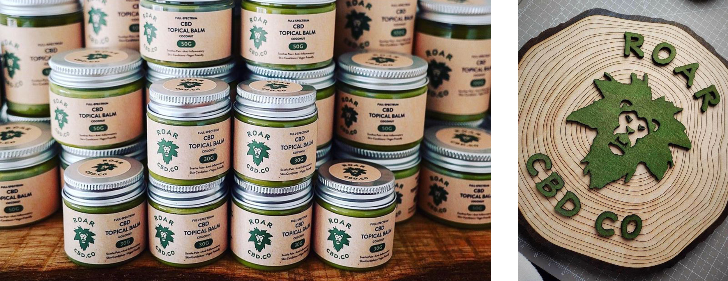
The UK-based CBD company had a vision for their logo, inspired by the owner’s dreadlocks, a lion’s head, and the cannabis leaf. This needed to be done in a tasteful way as to avoid feeling tacky or too on the nose. The final logo has been used across business cards, swag, and labels for all 47 of their products.
Water Wizards
The Tennessee-based pressure washing company was seeking their first logo. They wanted an aqua-inspired mark that would easily scale across their website, business cards, ad campaigns, merchandise and even a car wrap.